Commit graph

284 commits

Author SHA1 Message Date
Gusted 99ac7353eb
[MODERATION] User blocking
- Add the ability to block a user via their profile page.
- This will unstar their repositories and visa versa.
- Blocked users cannot create issues or pull requests on your the doer's repositories (mind that this is not the case for organizations).
- Blocked users cannot comment on the doer's opened issues or pull requests.
- Blocked users cannot add reactions to doer's comments.
- Blocked users cannot cause a notification trough mentioning the doer.

Reviewed-on: https://codeberg.org/forgejo/forgejo/pulls/540
(cherry picked from commit 687d852480)
(cherry picked from commit 0c32a4fde5)
(cherry picked from commit 1791130e3c)
(cherry picked from commit 37858b7e8f)
(cherry picked from commit a3e2bfd7e9)
(cherry picked from commit 7009b9fe87)

Conflicts: https://codeberg.org/forgejo/forgejo/pulls/1014
        routers/web/user/profile.go
        templates/user/profile.tmpl
(cherry picked from commit b2aec34791)
(cherry picked from commit e2f1b73752)

[MODERATION] organization blocking a user (#802)

- Resolves #476
- Follow up for: #540
- Ensure that the doer and blocked person cannot follow each other.
- Ensure that the block person cannot watch doer's repositories.
- Add unblock button to the blocked user list.
- Add blocked since information to the blocked user list.
- Add extra testing to moderation code.
- Blocked user will unwatch doer's owned repository upon blocking.
- Add flash messages to let the user know the block/unblock action was successful.
- Add "You haven't blocked any users" message.
- Add organization blocking a user.

Co-authored-by: Gusted <postmaster@gusted.xyz>
Reviewed-on: https://codeberg.org/forgejo/forgejo/pulls/802
(cherry picked from commit 0505a10421)
(cherry picked from commit 37b4e6ef9b)
(cherry picked from commit c17c121f2c)

[MODERATION] organization blocking a user (#802) (squash)

Changes to adapt to:

  6bbccdd177 Improve AJAX link and modal confirm dialog (#25210)

Refs: https://codeberg.org/forgejo/forgejo/pulls/882/files#issuecomment-945962
Refs: https://codeberg.org/forgejo/forgejo/pulls/882#issue-330561
(cherry picked from commit 523635f83c)
(cherry picked from commit 4743eaa6a0)
(cherry picked from commit eff5b43d2e)

Conflicts: https://codeberg.org/forgejo/forgejo/pulls/1014
        routers/web/user/profile.go
(cherry picked from commit 9d359be5ed)
(cherry picked from commit b1f3069a22)

[MODERATION] add user blocking API

- Follow up for: #540, #802
- Add API routes for user blocking from user and organization
perspective.
- The new routes have integration testing.
- The new model functions have unit tests.
- Actually quite boring to write and to read this pull request.

(cherry picked from commit f3afaf15c7)
(cherry picked from commit 6d754db3e5)
(cherry picked from commit 2a89ddc0ac)
(cherry picked from commit 4a147bff7e)

Conflicts:
        routers/api/v1/api.go
        templates/swagger/v1_json.tmpl
(cherry picked from commit bb8c339185)
(cherry picked from commit 5a11569a01)
(cherry picked from commit 2373c801ee)

[MODERATION] restore redirect on unblock

 ctx.RedirectToFirst(ctx.FormString("redirect_to"), ctx.ContextUser.HomeLink())

was replaced by

 ctx.JSONOK()

in 128d77a3a Following up fixes for "Fix inconsistent user profile layout across tabs" (#25739)

thus changing the behavior (nicely spotted by the tests). This
restores it.

(cherry picked from commit 597c243707)
(cherry picked from commit cfa539e590)

[MODERATION] Add test case (squash)

- Add an test case, to test an property of the function.

(cherry picked from commit 70dadb1916)

[MODERATION] Block adding collaborators

- Ensure that the doer and blocked user cannot add each other as
collaborators to repositories.
- The Web UI gets an detailed message of the specific situation, the API
gets an generic Forbidden code.
- Unit tests has been added.
- Integration testing for Web and API has been added.
- This commit doesn't introduce removing each other as collaborators on
the block action, due to the complexity of database calls that needs to
be figured out. That deserves its own commit and test code.

(cherry picked from commit 747be949a1)

[MODERATION] move locale_en-US.ini strings to avoid conflicts

Conflicts:
        web_src/css/org.css
        web_src/css/user.css
        https://codeberg.org/forgejo/forgejo/pulls/1180

(cherry picked from commit e53f955c88)

Conflicts:
        services/issue/comments.go
        https://codeberg.org/forgejo/forgejo/pulls/1212
(cherry picked from commit b4a454b576)

Conflicts:
        models/forgejo_migrations/migrate.go
        options/locale/locale_en-US.ini
        services/pull/pull.go
        https://codeberg.org/forgejo/forgejo/pulls/1264

[MODERATION] Remove blocked user collaborations with doer

- When the doer blocks an user, who is also an collaborator on an
repository that the doer owns, remove that collaboration.
- Added unit tests.
- Refactor the unit test to be more organized.

(cherry picked from commit ec87016178)
(cherry picked from commit 313e6174d8)

[MODERATION] QoL improvements (squash)

- Ensure that organisations cannot be blocked. It currently has no
effect, as all blocked operations cannot be executed from an
organisation standpoint.
- Refactored the API route to make use of the `UserAssignmentAPI`
middleware.
- Make more use of `t.Run` so that the test code is more clear about
which block of code belongs to which test case.
- Added more integration testing (to ensure the organisations cannot be
blocked and some authorization/permission checks).

(cherry picked from commit e9d638d075)

[MODERATION] s/{{avatar/{{ctx.AvatarUtils.Avatar/

(cherry picked from commit ce8b30be13)
(cherry picked from commit f911dc4025)

Conflicts:
	options/locale/locale_en-US.ini
	https://codeberg.org/forgejo/forgejo/pulls/1354
(cherry picked from commit c1b37b7fda)
(cherry picked from commit 856a2e0903)

[MODERATION] Show graceful error on comment creation

- When someone is blocked by the repository owner or issue poster and
try to comment on that issue, they get shown a graceful error.
- Adds integration test.

(cherry picked from commit 490646302e)
(cherry picked from commit d3d88667cb)
(cherry picked from commit 6818de13a9)

[MODERATION] Show graceful error on comment creation (squash) typo

(cherry picked from commit 1588d4834a)
(cherry picked from commit d510ea52d0)
(cherry picked from commit 8249e93a14)

[MODERATION] Refactor integration testing (squash)

- Motivation for this PR is that I'd noticed that a lot of repeated
calls are happening between the test functions and that certain tests
weren't using helper functions like `GetCSRF`, therefor this refactor of
the integration tests to keep it: clean, small and hopefully more
maintainable and understandable.
- There are now three integration tests: `TestBlockUser`,
`TestBlockUserFromOrganization` and `TestBlockActions` (and has been
moved in that order in the source code).
- `TestBlockUser` is for doing blocking related actions as an user and
`TestBlockUserFromOrganization` as an organisation, even though they
execute the same kind of tests they do not share any database calls or
logic and therefor it currently doesn't make sense to merge them
together (hopefully such oppurtinutiy might be presented in the future).
- `TestBlockActions` now contain all tests for actions that should be
blocked after blocking has happened, most tests now share the same doer
and blocked users and a extra fixture has been added to make this
possible for the comment test.
- Less code, more comments and more re-use between tests.

(cherry picked from commit ffb393213d)
(cherry picked from commit 85505e0f81)
(cherry picked from commit 0f3cf17761)

[MODERATION] Fix network error (squash)

- Fix network error toast messages on user actions such as follow and
unfollow. This happened because the javascript code now expects an JSON
to be returned, but this wasn't the case due to
cfa539e590127b4953b010fba3dea21c82a1714.
- The integration testing has been adjusted to instead test for the
returned flash cookie.

(cherry picked from commit 112bc25e54)
(cherry picked from commit 1194fe4899)
(cherry picked from commit 9abb95a844)

[MODERATION] Modernize frontend (squash)

- Unify blocked users list.
- Use the new flex list classes for blocked users list to avoid using
the CSS helper classes and thereby be consistent in the design.
- Fix the modal by using the new modal class.
- Remove the icon in the modal as looks too big in the new design.
- Fix avatar not displaying as it was passing the context where the user
should've been passed.
- Don't use italics for 'Blocked since' text.
- Use namelink template to display the user's name and homelink.

(cherry picked from commit ec935a16a3)
(cherry picked from commit 67f37c8346)

Conflicts:
	models/user/follow.go
	models/user/user_test.go
	routers/api/v1/user/follower.go
	routers/web/shared/user/header.go
	routers/web/user/profile.go
	templates/swagger/v1_json.tmpl
	https://codeberg.org/forgejo/forgejo/pulls/1468
(cherry picked from commit 6a9626839c)

Conflicts:
	tests/integration/api_nodeinfo_test.go
	https://codeberg.org/forgejo/forgejo/pulls/1508#issuecomment-1242385
(cherry picked from commit 7378b251b4)

Conflicts:
	models/fixtures/watch.yml
	models/issues/reaction.go
	models/issues/reaction_test.go
	routers/api/v1/repo/issue_reaction.go
	routers/web/repo/issue.go
	services/issue/issue.go
	https://codeberg.org/forgejo/forgejo/pulls/1547
(cherry picked from commit c2028930c1)
(cherry picked from commit d3f9134aee)
(cherry picked from commit 7afe154c5c)
2023-10-23 15:03:08 +02:00
MrDevil 510d07506e
[FIX] resolve confusing colors in languages stats by insert a gap (#27704)
The current language stats are too obsessed with color matching. Similar
colors are always next to each other. It is a bit troublesome to find
the place where the color matching is generated, so just follow the
example of github and add a gap.

## before

<img width="883" alt="image"
src="https://github.com/go-gitea/gitea/assets/12915306/cf54430c-616c-4b37-b561-5a37c20b2d94">

## after

<img width="877" alt="image"
src="https://github.com/go-gitea/gitea/assets/12915306/e518ea36-2b8f-4f11-a867-a58dc393db85">
2023-10-20 17:33:05 +00:00
silverwind 4539a7b0b4
Fix sticky diff header background (#27697)
Fixes: https://github.com/go-gitea/gitea/issues/27604

Add negative margins so the header covers any shadow of active elements.
No rendering change of the content of the header because the padding
counteracts the effect.

<img width="128" alt="image"
src="https://github.com/go-gitea/gitea/assets/115237/3d0f55b6-9351-4985-a290-da9a92d15b4e">
2023-10-20 14:56:19 +00:00
puni9869 4adc2a828d
Hide archived labels by default from the suggestions when assigning labels for an issue (#27451)
Followup of #27115
Finally closes #25237

## Screenshots
### Issue Sidebar
<img width="513" alt="image"
src="https://github.com/go-gitea/gitea/assets/80308335/9f7fda2f-5a03-4684-8619-fd3498a95b41">

### PR sidebar
<img width="367" alt="image"
src="https://github.com/go-gitea/gitea/assets/80308335/53db9b64-faec-4a67-91d6-76945596a469">

### PR sidebar with archived labels shown
<img width="352" alt="image"
src="https://github.com/go-gitea/gitea/assets/80308335/9dc5050f-4e69-4f76-bb83-582480a2281e">

---------

Signed-off-by: puni9869 <punitinani1@hotmail.com>
Co-authored-by: silverwind <me@silverwind.io>
2023-10-17 16:10:45 +02:00
wxiaoguang 6c501b1498
Improve dropdown button alignment and fix hover bug (#27632)
1. fix #27631 , and add samples to devtest page
2. fix incorrect color for "ui dropdown button" when hover
2023-10-16 07:26:08 +00:00
silverwind 532f166c4d
Enable shorthands in declaration-strict-value linter (#27597)
Enable [shorthand
matching](https://github.com/AndyOGo/stylelint-declaration-strict-value#expandshorthand)
in this lint rule and match color properties by regex. Patterns like
this will now fail lint:

```css
background: #123456;
border: 1px sold rgba(0,0,0,0);
```
2023-10-13 08:19:21 +00:00
Kyle D ac4ae35542
Remove max-width and add hide text overflow (#27359)
Closes https://github.com/go-gitea/gitea/issues/27358
2023-10-09 19:04:31 -04:00
Gary Wang abe8fe3527
Add hover background to wiki list page (#27507)
This patch adds a hover background for the wiki row in wiki list page,
which make its behavior more close to repo's file list page.

This patch also make the wiki-git-entry visible on the row is hovered
instead of the cel, so users won't be confused since the 'grid' is not
visible from the web page.

After the patch: (when the wiki named 'Home' is hovered)

![image](https://github.com/go-gitea/gitea/assets/10095765/f6c67c41-ad54-4ce4-a3b1-8c7551396ce0)
2023-10-08 10:07:55 +00:00
silverwind 023e937141
Rename the default themes to gitea-light, gitea-dark, gitea-auto (#27419)
Part of https://github.com/go-gitea/gitea/issues/27097:

- `gitea` theme is renamed to `gitea-light`
- `arc-green` theme is renamed to `gitea-dark`
- `auto` theme is renamed to `gitea-auto`

I put both themes in separate CSS files, removing all colors from the
base CSS. Existing users will be migrated to the new theme names. The
dark theme recolor will follow in a separate PR.

## ⚠️ BREAKING ⚠️

1. If there are existing custom themes with the names `gitea-light` or
`gitea-dark`, rename them before this upgrade and update the `theme`
column in the `user` table for each affected user.
2. The theme in `<html>` has moved from `class="theme-name"` to
`data-theme="name"`, existing customizations that depend on should be
updated.

---------

Co-authored-by: Lunny Xiao <xiaolunwen@gmail.com>
Co-authored-by: Giteabot <teabot@gitea.io>
2023-10-06 09:46:36 +02:00
Denys Konovalov 33de64cb21
link to file from its history (#27354)
Fixes #3852
Fixes https://github.com/go-gitea/gitea/issues/26707

Add a button on file history which directs you to the file at the
selected commit.

Co-authored-by: silverwind <me@silverwind.io>
2023-10-02 04:04:32 +00:00
puni9869 50070550a8
Hide archived labels when filtering by labels on the issue list (#27115)
Followup  https://github.com/go-gitea/gitea/pull/26820
## Archived labels UI for issue filter and issue filter actions for
issues/pull request pages.

Changed:
* Enhanced the Issue filter and Issue filter actions UI page to
seamlessly incorporate a list of archived labels.
* Pagination functionality is same as before. If archived label checkbox
is checked then we are adding a query string`archived=true` in the url
to save the state of page.
* Issue filter actions menu is separated into different template.
* Adding the archived flag in issue url labels.
* Pull Request page is also work the same.

Outsourced:
* Defer the implementation of specialized handling for archived labels
to upcoming pull requests. This step will be undertaken subsequent to
the successful merge of this pull request.

Screenshots
### Issue page
<img width="1360" alt="image"
src="https://github.com/go-gitea/gitea/assets/80308335/d7efb2ef-5b2b-449d-83f0-d430a32ec432">

### Issue page with label filter on archived label checkbox when not
checked --> No archived label is there in list
<img width="1249" alt="image"
src="https://github.com/go-gitea/gitea/assets/80308335/ceea68ef-91f2-4693-910f-2e25e236bfc9">

### Issue page with label filter on archived label checkbox when checked
--> Show archived label in the list.
<img width="710" alt="image"
src="https://github.com/go-gitea/gitea/assets/80308335/2414d26b-2079-4c3c-bd9e-f2f5411bcabf">

### Issue page with label filter on issue action menu on archived label
checkbox when checked --> Show archived label in the list.
<img width="409" alt="image"
src="https://github.com/go-gitea/gitea/assets/80308335/259cac87-3e21-4778-99a2-a6a0b8c81178">


### Applied the archived=true in Issue labels when archived checkbox is
checked.
<img width="984" alt="image"
src="https://github.com/go-gitea/gitea/assets/80308335/657ce3db-c0ae-402e-b12d-3b580d3c2ed0">

---


Part of https://github.com/go-gitea/gitea/issues/25237

---------

Signed-off-by: puni9869 <punitinani1@hotmail.com>
Co-authored-by: delvh <dev.lh@web.de>
Co-authored-by: Giteabot <teabot@gitea.io>
2023-10-01 09:04:39 -04:00
silverwind 83f571628d
Feed UI Improvements (#27356)
Various improvements related to feeds:

- Fix markdown rendering
- Increase font size from 13px to default 14px via `flex-item`
- Add style to hashes
- Move the timestamp to title line. I realize it's not optimal for
translation, we may need to change all these translations

Before:
<img width="768" alt="Screenshot 2023-09-29 at 22 52 58"
src="https://github.com/go-gitea/gitea/assets/115237/edda8b84-23cf-4a43-90ad-a892798f4e6c">

After:
<img width="781" alt="Screenshot 2023-09-29 at 22 58 09"
src="https://github.com/go-gitea/gitea/assets/115237/7097474d-efcf-4f22-a2ab-834a4e25c4e8">
2023-09-30 15:48:34 +00:00
Rafael Heard 4cb51cb985
Absolute positioned checkboxes overlay floated elements (#26870)
Currently, checkboxes are positioned as absolute. This positioning
causes the input to overlay an element that has been floated within the
editor. Floated elements are useful if you want your text to wrap around
this element. This PR fixes the overlaying of checkboxes by removing the
absolute positioning, updating the `ul` padding, and
displaying`.task-list-item` `flex` to ensure inputs and the associated
label are on the same line.

Screenshots:

Before:
<img width="762" alt="Screenshot 2023-09-01 at 3 40 59 PM"
src="https://github.com/go-gitea/gitea/assets/6152817/570247c7-7f5c-4697-bfc9-ad4655e37991">

After:
<img width="762" alt="Screenshot 2023-09-01 at 3 42 20 PM"
src="https://github.com/go-gitea/gitea/assets/6152817/db53df45-1294-4eee-84c0-b21ac4fdf805">

---------

Co-authored-by: rafh <rafaelheard@gmail.com>
2023-09-30 09:30:44 +00:00
wxiaoguang 1f00bc44b2
Fix review UI (#27322)
Close #26730


1. The `diff-detail-box` was abused, it shouldn't be used for
"DiffFileList/DiffFileTree".
2. Fix the sticky position for various screens.


![image](https://github.com/go-gitea/gitea/assets/2114189/558a5c06-c94c-4e5c-8395-d38473dd21c2)


![image](https://github.com/go-gitea/gitea/assets/2114189/3390fb0e-7dc7-457f-bd0c-398fdb6d24c0)


![image](https://github.com/go-gitea/gitea/assets/2114189/d19dd350-aecf-4909-8ef9-73b09d94560e)
2023-09-28 10:00:26 +00:00
wxiaoguang 72c68177ab
Improve issue history dialog and make poster can delete their own history (#27323)
Fix #27313 (see the comment)

And some UI improvements:

### Before


![image](https://github.com/go-gitea/gitea/assets/2114189/420a314d-8f34-4e30-a557-f41cf4f0d2f2)


![image](https://github.com/go-gitea/gitea/assets/2114189/60ca0be4-b55e-4e65-be73-fd53e0d4fc36)


### After


![image](https://github.com/go-gitea/gitea/assets/2114189/d354f815-5a0c-4e63-8d59-d03ed344dbea)


![image](https://github.com/go-gitea/gitea/assets/2114189/6ef437a4-aa6f-4917-a260-00625ee71e79)


![image](https://github.com/go-gitea/gitea/assets/2114189/9d88a36c-616b-4dc9-8c6b-76adaad8acf6)
2023-09-28 08:43:20 +00:00
wxiaoguang 7ea2a910ce
Improve branch list UI (#27319)
1. Put the `"octicon-shield-lock"` into the flex container, then it
doesn't need a separate flex box
2. Remove some unnecessary `gt-df` helpers
3. Make `btn` button has the same flex behavior as `ui button`


![image](https://github.com/go-gitea/gitea/assets/2114189/60ce75f7-7fac-4157-9c42-91c7dee9300e)


![image](https://github.com/go-gitea/gitea/assets/2114189/ea606baf-6f52-41e1-b964-c4840d3b1529)
2023-09-28 04:04:32 +00:00
silverwind 6af34c09a7
Use mask-based fade-out effect for .new-menu (#27181)
The `.new-menu` was using a pseudo-element based fade-out effect.
Replace this with a more modern mask-based effect which in this case
required a child element to avoid fading out the background as well, so
I applied it to child `new-menu-inner` which was present on all these
menus except explore where I added it.

There is no visual difference except that the items on the explore page
have no `gap` between them any longer, making it consistent with other
menus. Before and after:

<img width="221" alt="Screenshot 2023-09-21 at 21 13 19"
src="https://github.com/go-gitea/gitea/assets/115237/b4a38ce2-cee1-4c54-84a5-e1d0bfd79e29">
<img width="222" alt="Screenshot 2023-09-21 at 21 32 36"
src="https://github.com/go-gitea/gitea/assets/115237/bb6b1335-d935-4ad4-bb85-3b0fc3027c2b">

Also, this cleans up the related CSS vars:

- `--color-header-wrapper-transparent` is removed, no longer needed
- `--color-header-wrapper` is defined in base theme as well, was
previously unset and therefor transparent.

[no whitespace
diff](https://github.com/go-gitea/gitea/pull/27181/files?diff=unified&w=1)
[demo of mask fade](https://jsfiddle.net/silverwind/tsfadb3u/)
2023-09-25 01:03:00 +00:00
silverwind a50002c75c
Fix z-index on markdown completion (#27237)
Fixes: https://github.com/go-gitea/gitea/issues/27230
2023-09-25 01:29:36 +02:00
Denys Konovalov 63b25e816d
fix issues on action runners page (#27226)
- switch from some weird status badge to label
- translate untranslated `Reset registration token` string
- change documentation link from act_runner README to Gitea Docs site
- fix "No runners available" message width
- use `ctx.Locale.Tr` where possible


![grafik](https://github.com/go-gitea/gitea/assets/47871822/65547228-f9ed-4f80-9cfd-df5e55513a44)
2023-09-24 14:12:21 -04:00
wxiaoguang c2cabe7b28
Fix repo sub menu (#27169)
Fix #27166
2023-09-21 21:16:14 +08:00
silverwind 8099238618
Change green buttons to primary color (#27099)
I think it's better if the primary actions have primary color instead of
green which fits better into the overall single-color UI design. This PR
currently replaces every green button with primary:

<img width="141" alt="Screenshot 2023-09-16 at 14 07 59"
src="https://github.com/go-gitea/gitea/assets/115237/843c1e50-4fb2-4ec6-84ba-0efb9472dcbe">
<img width="161" alt="Screenshot 2023-09-16 at 14 07 51"
src="https://github.com/go-gitea/gitea/assets/115237/9442195a-a3b2-4a42-b262-8377d6f5c0d1">

Modal actions now use uncolored/primary instead of previous green/red
colors. I also removed the box-shadow on all basic buttons:

<img width="259" alt="Screenshot 2023-09-16 at 14 16 39"
src="https://github.com/go-gitea/gitea/assets/115237/5beea529-127a-44b0-8d4c-afa7b034a490">
<img width="261" alt="Screenshot 2023-09-16 at 14 17 42"
src="https://github.com/go-gitea/gitea/assets/115237/4757f7b2-4d46-49bc-a797-38bb28437b88">

The change currently includes the "Merge PR" button, for which we might
want to make an exception to match the icon color there:

<img width="442" alt="Screenshot 2023-09-16 at 14 33 53"
src="https://github.com/go-gitea/gitea/assets/115237/993ac1a5-c94d-4895-b76c-0d872181a70b">
2023-09-18 22:05:31 +00:00
puni9869 a50d9af876
Display archived labels specially when listing labels (#26820)
Follow up https://github.com/go-gitea/gitea/pull/26741

Changes:
Added archived label for org labels and added into issue filter list.


Part of https://github.com/go-gitea/gitea/issues/25237

---------

Signed-off-by: puni9869 <punitinani1@hotmail.com>
Co-authored-by: silverwind <me@silverwind.io>
2023-09-18 04:54:05 +00:00
wxiaoguang e97baed800
Remove a gt-float-right and some unnecessary helpers (#27110)
Follow  Remove polluted .ui.right #26825 

Remove more `gt-float-right`, remove unnecessary helpers, remove
negative margin tricks.

![image](https://github.com/go-gitea/gitea/assets/2114189/2785c6e6-7823-4699-a4f3-184eef50ceda)
2023-09-18 12:25:36 +08:00
puni9869 a1b2a11812
Ui correction in mobile view nav bar left aligned items. (#27046)
As title
From the long time I was looking for this UI, Now its the time to fix
it.

Before
<img width="252" alt="image"
src="https://github.com/go-gitea/gitea/assets/80308335/963f2cb4-5cfd-4a14-ab85-88e25c3daef5">

<img width="502" alt="image"
src="https://github.com/go-gitea/gitea/assets/80308335/58453ef1-2555-4568-95d0-5293055b33b8">

---------

Co-authored-by: wxiaoguang <wxiaoguang@gmail.com>
Co-authored-by: Giteabot <teabot@gitea.io>
2023-09-16 16:09:25 +02:00
Kerwin Bryant a38eca3f52
Fix Fomantic's line-height causing vertical scrollbars to appear (#26961)
Before:

![before](https://github.com/go-gitea/gitea/assets/3371163/bc5a3b20-3490-4e14-ab1d-2fcfbc4a2e20)

After:

![after](https://github.com/go-gitea/gitea/assets/3371163/70e8be6a-11a2-46af-9e1e-78ac153cd2a4)

---  

1. **Remove the scroll bar exception that in the a tag**  
2. **Reduce the actual width of the a tag to the actual width of the
content**

![c363a5b5883e105a0c65d7337893b50](https://github.com/go-gitea/gitea/assets/3371163/789d9b83-ad14-46d2-8a1b-df551a063f6a)
As shown in the screenshot, the red box area should not be clickable
2023-09-13 09:08:45 +00:00
puni9869 0989f437df
Dashboard context dropdown position fix on landing page in mobile view. (#27047)
as title.

Screensots

before 

![image](https://github.com/go-gitea/gitea/assets/80308335/d72da379-1fb1-4d75-9f3e-f70e06ad4065)

after

![image](https://github.com/go-gitea/gitea/assets/80308335/110ea806-feed-4947-bf56-2985b1e1ec5f)
2023-09-13 15:15:36 +08:00
wxiaoguang 739e47cd80
Improve repo/user/org search (#27030)
* Fix a regression from #26809 (the `data-org` is missing)
* Remove unnecessary style

Screenshots:


![image](https://github.com/go-gitea/gitea/assets/2114189/3f5cf628-db7f-4705-898a-7a4a1fbfbba8)


![image](https://github.com/go-gitea/gitea/assets/2114189/453d1fad-1090-4524-bf45-6c5da2465f04)


![image](https://github.com/go-gitea/gitea/assets/2114189/f14d9808-7596-42c8-84b4-0d57a0bf2278)
2023-09-12 16:44:48 +00:00
wxiaoguang 1875362383
Fix "delete" modal dialog for issue/PR (#27015)
Close #27012

By the way, rename the single-word ID to a long ID.


![image](https://github.com/go-gitea/gitea/assets/2114189/9f05ecc3-0a3d-4612-85e0-da60f7a45d2e)


![image](https://github.com/go-gitea/gitea/assets/2114189/9133808c-bd89-4265-99c5-83b986bd266f)
2023-09-11 17:06:05 +00:00
wxiaoguang dd6e8ab57b
Improve "language stats" UI (#26968)
Before:

* The layout is quite complex 
* The UI flickers when switch the stats (https://try.gitea.io/)

After:

* Simplify the code
* The UI doesn't flicker
2023-09-10 18:27:23 +08:00
wxiaoguang 58abd4f06c
Improve issue list layout (#26983)
Align everything with a new layout.

* Use "baseline" for some special elements, the "flex-item-icon" is for
the issue list only at the moment and I think it should be general
enough now (but not using "flex-item-leading" anymore in this case).
* Make the labels stretch themselves.
2023-09-09 20:23:57 +08:00
silverwind 4693bdbda0
Chroma color tweaks (#26978) 2023-09-08 11:03:01 -05:00
wxiaoguang ffa4949eaa
Improve flex list UI (#26970)
1. There is already `gt-ac`, so no need to introduce `flex-item-center`
2. The `flex-item-baseline` and `.flex-item-icon svg { margin-top: 1px
}` seem to be a tricky patch, they don't resolve the root problem, and
still cause misalignment in some cases.
* The root problem is: the "icon" needs to align with the sibling
"title"
    * So, make the "icon" and the "title" both have the same height 
3. `flex-text-inline` could only be used if the element is really
"inline", otherwise its `vertical-align` would make the box size change.
In most cases, `flex-text-block` is good enough.


![image](https://github.com/go-gitea/gitea/assets/2114189/1b7acfc2-b1c7-4e9c-a983-2fa932026479)

---------

Co-authored-by: silverwind <me@silverwind.io>
Co-authored-by: Giteabot <teabot@gitea.io>
2023-09-08 13:57:18 +00:00
wxiaoguang 1221221595
Add "dir=auto" for input/textarea elements by default (#26735)
Co-authored-by: silverwind <me@silverwind.io>
Co-authored-by: Giteabot <teabot@gitea.io>
2023-09-07 08:00:20 +00:00
wxiaoguang 419003adb2
Improve SSH Key / GPG Key / Deploy Key UI (#26949)
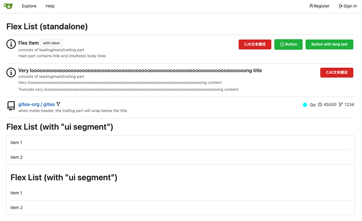
1. In many cases, the `flex-list` has previous and next `gt-hidden`
siblings, so relax the CSS selector to remove all ".segument .flex-list"
paddings.
2. Make the "Add key" button can toggle
3. Move help message into the related segment(panel). Otherwise users
would misread the message, eg: the SSH help seemed for GPG because they
are so near
4. Move modal element into the segment element, otherwise it affects the
layout
2023-09-07 01:13:11 +00:00
wxiaoguang 2715ef6558
Fix scoped label layout (#26932)
Fix #26931
2023-09-06 12:22:38 +00:00
Kerwin Bryant 113eb5fc24
Fix UI anomalies (#26929) 2023-09-06 07:00:45 +00:00
wxiaoguang 682552378f
More fixes for the "commit-body" (#26898)
The changes for "commit-body" in #26877 are not ideal.

The reason is: the "commit-body" is usually a `<pre>`, it has default
margins. In most cases, we do not need that large margin. So, this PR
introduces a general but small margin for all "commit-body" elements.
Then these `gt-m-0` could be removed.

The `:not` selector is not needed, because the `.timeline-item` selector
is already clear enough.
2023-09-04 13:38:59 +00:00
wxiaoguang 51cfe0e7de
Remove CSS has selector and improve various styles (#26891)
Replace  #26850

Major changes:

1. Remove all `has` selectors, it is still not supported by firefox.
Actually there could be some more general and clearer approaches
2. Remove `two-toggle-buttons`, the `.ui.buttons` just works well
3. Rewrite the `.ui.buttons` border styles, see the screenshots
4. Remove the "fine-tuning" paddings from the the flex children, they
could layout themselves well.

![image](https://github.com/go-gitea/gitea/assets/2114189/a32ed6f3-60f7-43d5-9492-62c45d2397f6)

![image](https://github.com/go-gitea/gitea/assets/2114189/5cb173c5-c942-4237-8cb4-2697220b3f06)

![image](https://github.com/go-gitea/gitea/assets/2114189/8a1c12b3-a632-48ff-b1a7-a01a4417f821)

![image](https://github.com/go-gitea/gitea/assets/2114189/46bde1bd-9113-4231-965d-6ec9076f6a3b)
2023-09-04 18:22:46 +08:00
wxiaoguang fba7150ca9
Refactor "shortsha" (#26877)
The old code used complex `if` blocks and strange HTML layouts.

<details>


![image](https://github.com/go-gitea/gitea/assets/2114189/7fbee2b8-d150-4e6b-b67e-83400fa290eb)

</details>

This PR refactors the template code and remove legacy CSS styles. The UI
doesn't change much.


![image](https://github.com/go-gitea/gitea/assets/2114189/3e195df9-0ab5-4182-bcb2-bb20cad823f2)


![image](https://github.com/go-gitea/gitea/assets/2114189/f707a49f-be41-4dfe-871f-2869f2230380)
2023-09-03 02:58:52 +00:00
6543 79f7329971
Make it posible to customize nav text color via css var (#26807)
---
*Sponsored by Kithara Software GmbH*
2023-09-02 05:10:41 +02:00
wxiaoguang fcb4941d47
Remove some unused CSS styles (#26852)
1. `icons`: globally searched, no use in templates.
2. toast's `display: inline-block;`: there is a `display: flex` below.
2023-09-01 08:59:38 +02:00
silverwind 9b76df53dc
Minor dashboard tweaks, fix flex-list margins (#26829)
Some small dashboard tweaks:

- Remove margin-bottom from divider so first item does not appear to
have un-equal margins
- Restore previous icon color
- Add slight margin-right to icon

Before:
<img width="783" alt="Screenshot 2023-08-31 at 00 10 28"
src="https://github.com/go-gitea/gitea/assets/115237/b75f70d7-8704-4afb-866d-fea0484c52d4">

After:
<img width="783" alt="Screenshot 2023-08-31 at 00 10 08"
src="https://github.com/go-gitea/gitea/assets/115237/50ed0c47-6f7c-449e-a054-13091369d43f">

---------

Co-authored-by: wxiaoguang <wxiaoguang@gmail.com>
2023-08-31 21:28:45 +00:00
wxiaoguang d5703d4a1b
Remove "TODO" tasks from CSS file (#26835)
1. Use `gt-invisible` instead of `invisible`.
2. Use `gt-word-break` instead of `dont-break-out` (there is a slight
different "hyphens", but I think it won't affect too much since it is
only used for the "full name").
3. Remove `.small.button:has(svg)` , now our buttons could layout SVG
correctly, and actually I didn't see this CSS class is used in code.
2023-08-31 10:49:53 +00:00
Denys Konovalov 5b5bb8d354
User details page (#26713)
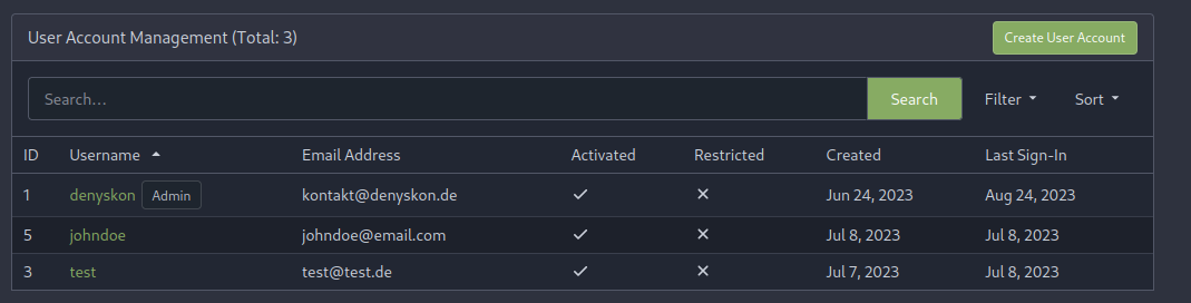
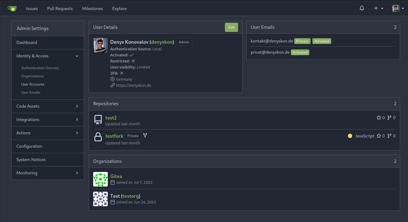
This PR implements a proposal to clean up the admin users table by
moving some information out to a separate user details page (which also
displays some additional information).

Other changes:
- move edit user page from `/admin/users/{id}` to
`/admin/users/{id}/edit` -> `/admin/users/{id}` now shows the user
details page
- show if user is instance administrator as a label instead of a
separate column
- separate explore users template into a page- and a shared one, to make
it possible to use it on the user details page
- fix issue where there was no margin between alert message and
following content on admin pages

<details>

<summary>Screenshots</summary>


![grafik](https://github.com/go-gitea/gitea/assets/47871822/1ad57ac9-f20a-45a4-8477-ffe572a41e9e)


![grafik](https://github.com/go-gitea/gitea/assets/47871822/25786ecd-cb9d-4c92-90f4-e7f4292c073b)


</details>

Partially resolves #25939

---------

Co-authored-by: Giteabot <teabot@gitea.io>
2023-08-31 11:21:18 +02:00
silverwind 3d109861dd
Render code blocks in repo description (#26830)
Backtick syntax now works in repo description too. Also, I replaced the
CSS for this was a new single class, making it more flexible and not
dependent on a parent. Also, very slightly reduced font size from 16.8px
to 16px.

---------

Co-authored-by: wxiaoguang <wxiaoguang@gmail.com>
2023-08-31 05:01:01 +00:00
wxiaoguang 19a1e1b20e
Remove polluted .ui.right (#26825)
Each change is tested manually line by line. There are too many changes
so I can't share dozens of screenshots.

In short:

1. `ui right` could be still used in `ui top attached header`, because
there is a special case.
2. A lot of `ui right` are just no-op, so they can be removed safely.
3. Some of the `ui right` should be replaced by `gt-float-right` (to
avoid breaking, leave them to the future).
4. A few of the `ui right` could be rewritten by flex.
2023-08-31 02:29:59 +00:00
wxiaoguang 1bb9b1c4d9
Remove polluted ".ui.left" style (#26809) 2023-08-30 21:46:24 +08:00
delvh 2590707122
Remove fomantic text module (#26777)
Corollary to #26775:
All selectors I found that are actually used and not necessarily present
in the current code have been copied to `web_src/css/base.css`.
Everything else should be a clean removal.
2023-08-30 10:37:17 +00:00
wxiaoguang 1a9998ce91
Improve flex list item padding (#26779)
Replace #26761

It's better to keep children elements simple, and let parent containers
layout the necessary padding/margin.

The old `not(:last-child)` and `.flex-item + .flex-item` are not easy to
maintain (for example, what if the developer would like to use a "tiny
height" item?)

The old approach also makes some UI look strange because the first item
doesn't have proper padding-top.

In this PR, we just simply use `.flex-item { padding: ... }`:

* Developers could manually set the item height they want easily
* It's easier to make it work with various containers -- with padding
(`ui segment`) and without padding (`div`)

And added more samples/examples.


![image](https://github.com/go-gitea/gitea/assets/2114189/719ea712-0241-4426-b67f-5723993c4ed7)

Co-authored-by: Giteabot <teabot@gitea.io>
2023-08-29 23:13:30 +00:00
wxiaoguang 96ba747ff2
Fix notification circle (border-radius) (#26794)
`border-radius` means `radius`, not `diameter`, so it should be `50%` and `boxHeight / 2`
2023-08-29 14:03:34 +00:00