Commit graph

257 commits

Author SHA1 Message Date
Gusted
9d0bee784d
[GITEA] Use vertical tabs on issue filters
- This is actually https://github.com/go-gitea/gitea/pull/19978 &
https://github.com/go-gitea/gitea/pull/19486 but was removed in one of
the UI refactors of v1.20
- This is a very technical fix and is best explained in the CSS
comments. But the short version: When there's an overflow being set, but
you want an element to 'break out' of that overflow with `position:
absolute`, it sometimes doesn't work! You need to set some CSS to let
the browser know that the element needs to use an element outside of
that overflow as 'clip parent'.
- Resolves my internal frustration with the mobile UI constantly getting broken.

(cherry picked from commit 879f842bed)
(cherry picked from commit 6099c9b41b)
(cherry picked from commit 0749d00b16)
(cherry picked from commit ec6a5428a7)
2023-09-11 18:09:23 +02:00
wxiaoguang
dd6e8ab57b
Improve "language stats" UI (#26968)
Before:

* The layout is quite complex 
* The UI flickers when switch the stats (https://try.gitea.io/)

After:

* Simplify the code
* The UI doesn't flicker
2023-09-10 18:27:23 +08:00
wxiaoguang
58abd4f06c
Improve issue list layout (#26983)
Align everything with a new layout.

* Use "baseline" for some special elements, the "flex-item-icon" is for
the issue list only at the moment and I think it should be general
enough now (but not using "flex-item-leading" anymore in this case).
* Make the labels stretch themselves.
2023-09-09 20:23:57 +08:00
silverwind
4693bdbda0
Chroma color tweaks (#26978) 2023-09-08 11:03:01 -05:00
wxiaoguang
ffa4949eaa
Improve flex list UI (#26970)
1. There is already `gt-ac`, so no need to introduce `flex-item-center`
2. The `flex-item-baseline` and `.flex-item-icon svg { margin-top: 1px
}` seem to be a tricky patch, they don't resolve the root problem, and
still cause misalignment in some cases.
* The root problem is: the "icon" needs to align with the sibling
"title"
    * So, make the "icon" and the "title" both have the same height 
3. `flex-text-inline` could only be used if the element is really
"inline", otherwise its `vertical-align` would make the box size change.
In most cases, `flex-text-block` is good enough.


![image](https://github.com/go-gitea/gitea/assets/2114189/1b7acfc2-b1c7-4e9c-a983-2fa932026479)

---------

Co-authored-by: silverwind <me@silverwind.io>
Co-authored-by: Giteabot <teabot@gitea.io>
2023-09-08 13:57:18 +00:00
wxiaoguang
1221221595
Add "dir=auto" for input/textarea elements by default (#26735)
Co-authored-by: silverwind <me@silverwind.io>
Co-authored-by: Giteabot <teabot@gitea.io>
2023-09-07 08:00:20 +00:00
wxiaoguang
419003adb2
Improve SSH Key / GPG Key / Deploy Key UI (#26949)
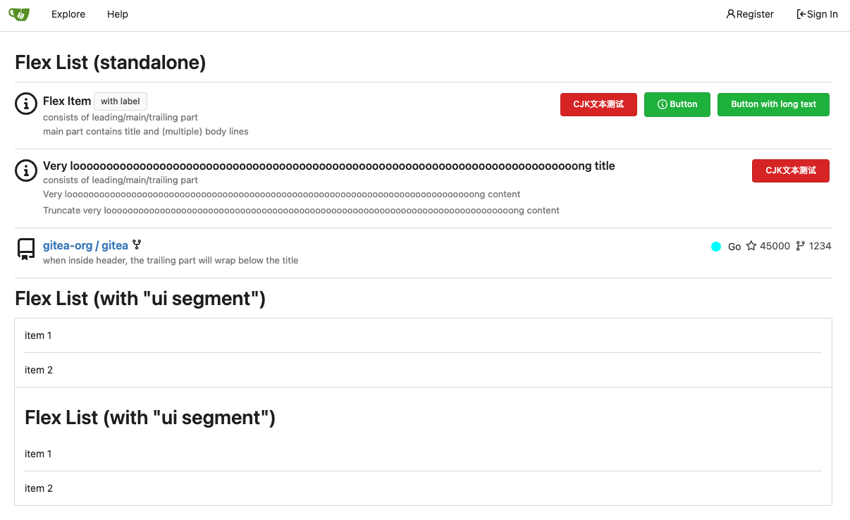
1. In many cases, the `flex-list` has previous and next `gt-hidden`
siblings, so relax the CSS selector to remove all ".segument .flex-list"
paddings.
2. Make the "Add key" button can toggle
3. Move help message into the related segment(panel). Otherwise users
would misread the message, eg: the SSH help seemed for GPG because they
are so near
4. Move modal element into the segment element, otherwise it affects the
layout
2023-09-07 01:13:11 +00:00
wxiaoguang
2715ef6558
Fix scoped label layout (#26932)
Fix #26931
2023-09-06 12:22:38 +00:00
Kerwin Bryant
113eb5fc24
Fix UI anomalies (#26929) 2023-09-06 07:00:45 +00:00
wxiaoguang
682552378f
More fixes for the "commit-body" (#26898)
The changes for "commit-body" in #26877 are not ideal.

The reason is: the "commit-body" is usually a `<pre>`, it has default
margins. In most cases, we do not need that large margin. So, this PR
introduces a general but small margin for all "commit-body" elements.
Then these `gt-m-0` could be removed.

The `:not` selector is not needed, because the `.timeline-item` selector
is already clear enough.
2023-09-04 13:38:59 +00:00
wxiaoguang
51cfe0e7de
Remove CSS has selector and improve various styles (#26891)
Replace  #26850

Major changes:

1. Remove all `has` selectors, it is still not supported by firefox.
Actually there could be some more general and clearer approaches
2. Remove `two-toggle-buttons`, the `.ui.buttons` just works well
3. Rewrite the `.ui.buttons` border styles, see the screenshots
4. Remove the "fine-tuning" paddings from the the flex children, they
could layout themselves well.

![image](https://github.com/go-gitea/gitea/assets/2114189/a32ed6f3-60f7-43d5-9492-62c45d2397f6)

![image](https://github.com/go-gitea/gitea/assets/2114189/5cb173c5-c942-4237-8cb4-2697220b3f06)

![image](https://github.com/go-gitea/gitea/assets/2114189/8a1c12b3-a632-48ff-b1a7-a01a4417f821)

![image](https://github.com/go-gitea/gitea/assets/2114189/46bde1bd-9113-4231-965d-6ec9076f6a3b)
2023-09-04 18:22:46 +08:00
wxiaoguang
fba7150ca9
Refactor "shortsha" (#26877)
The old code used complex `if` blocks and strange HTML layouts.

<details>


![image](https://github.com/go-gitea/gitea/assets/2114189/7fbee2b8-d150-4e6b-b67e-83400fa290eb)

</details>

This PR refactors the template code and remove legacy CSS styles. The UI
doesn't change much.


![image](https://github.com/go-gitea/gitea/assets/2114189/3e195df9-0ab5-4182-bcb2-bb20cad823f2)


![image](https://github.com/go-gitea/gitea/assets/2114189/f707a49f-be41-4dfe-871f-2869f2230380)
2023-09-03 02:58:52 +00:00
6543
79f7329971
Make it posible to customize nav text color via css var (#26807)
---
*Sponsored by Kithara Software GmbH*
2023-09-02 05:10:41 +02:00
wxiaoguang
fcb4941d47
Remove some unused CSS styles (#26852)
1. `icons`: globally searched, no use in templates.
2. toast's `display: inline-block;`: there is a `display: flex` below.
2023-09-01 08:59:38 +02:00
silverwind
9b76df53dc
Minor dashboard tweaks, fix flex-list margins (#26829)
Some small dashboard tweaks:

- Remove margin-bottom from divider so first item does not appear to
have un-equal margins
- Restore previous icon color
- Add slight margin-right to icon

Before:
<img width="783" alt="Screenshot 2023-08-31 at 00 10 28"
src="https://github.com/go-gitea/gitea/assets/115237/b75f70d7-8704-4afb-866d-fea0484c52d4">

After:
<img width="783" alt="Screenshot 2023-08-31 at 00 10 08"
src="https://github.com/go-gitea/gitea/assets/115237/50ed0c47-6f7c-449e-a054-13091369d43f">

---------

Co-authored-by: wxiaoguang <wxiaoguang@gmail.com>
2023-08-31 21:28:45 +00:00
wxiaoguang
d5703d4a1b
Remove "TODO" tasks from CSS file (#26835)
1. Use `gt-invisible` instead of `invisible`.
2. Use `gt-word-break` instead of `dont-break-out` (there is a slight
different "hyphens", but I think it won't affect too much since it is
only used for the "full name").
3. Remove `.small.button:has(svg)` , now our buttons could layout SVG
correctly, and actually I didn't see this CSS class is used in code.
2023-08-31 10:49:53 +00:00
Denys Konovalov
5b5bb8d354
User details page (#26713)
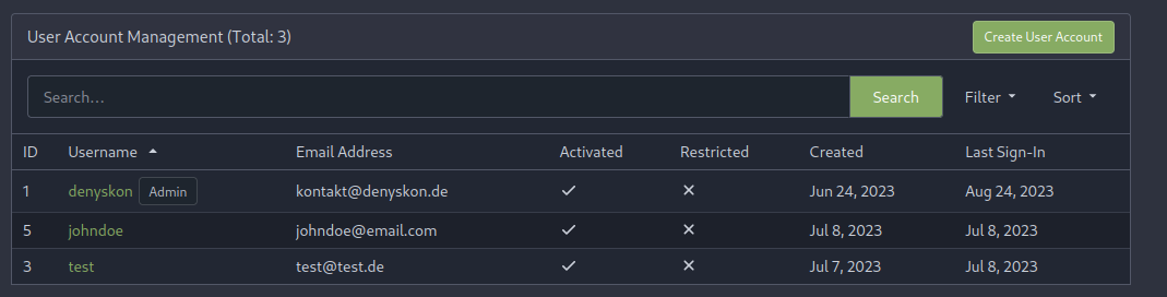
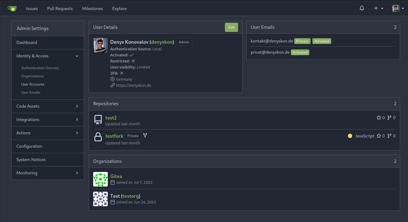
This PR implements a proposal to clean up the admin users table by
moving some information out to a separate user details page (which also
displays some additional information).

Other changes:
- move edit user page from `/admin/users/{id}` to
`/admin/users/{id}/edit` -> `/admin/users/{id}` now shows the user
details page
- show if user is instance administrator as a label instead of a
separate column
- separate explore users template into a page- and a shared one, to make
it possible to use it on the user details page
- fix issue where there was no margin between alert message and
following content on admin pages

<details>

<summary>Screenshots</summary>


![grafik](https://github.com/go-gitea/gitea/assets/47871822/1ad57ac9-f20a-45a4-8477-ffe572a41e9e)


![grafik](https://github.com/go-gitea/gitea/assets/47871822/25786ecd-cb9d-4c92-90f4-e7f4292c073b)


</details>

Partially resolves #25939

---------

Co-authored-by: Giteabot <teabot@gitea.io>
2023-08-31 11:21:18 +02:00
silverwind
3d109861dd
Render code blocks in repo description (#26830)
Backtick syntax now works in repo description too. Also, I replaced the
CSS for this was a new single class, making it more flexible and not
dependent on a parent. Also, very slightly reduced font size from 16.8px
to 16px.

---------

Co-authored-by: wxiaoguang <wxiaoguang@gmail.com>
2023-08-31 05:01:01 +00:00
wxiaoguang
19a1e1b20e
Remove polluted .ui.right (#26825)
Each change is tested manually line by line. There are too many changes
so I can't share dozens of screenshots.

In short:

1. `ui right` could be still used in `ui top attached header`, because
there is a special case.
2. A lot of `ui right` are just no-op, so they can be removed safely.
3. Some of the `ui right` should be replaced by `gt-float-right` (to
avoid breaking, leave them to the future).
4. A few of the `ui right` could be rewritten by flex.
2023-08-31 02:29:59 +00:00
wxiaoguang
1bb9b1c4d9
Remove polluted ".ui.left" style (#26809) 2023-08-30 21:46:24 +08:00
delvh
2590707122
Remove fomantic text module (#26777)
Corollary to #26775:
All selectors I found that are actually used and not necessarily present
in the current code have been copied to `web_src/css/base.css`.
Everything else should be a clean removal.
2023-08-30 10:37:17 +00:00
wxiaoguang
1a9998ce91
Improve flex list item padding (#26779)
Replace #26761

It's better to keep children elements simple, and let parent containers
layout the necessary padding/margin.

The old `not(:last-child)` and `.flex-item + .flex-item` are not easy to
maintain (for example, what if the developer would like to use a "tiny
height" item?)

The old approach also makes some UI look strange because the first item
doesn't have proper padding-top.

In this PR, we just simply use `.flex-item { padding: ... }`:

* Developers could manually set the item height they want easily
* It's easier to make it work with various containers -- with padding
(`ui segment`) and without padding (`div`)

And added more samples/examples.


![image](https://github.com/go-gitea/gitea/assets/2114189/719ea712-0241-4426-b67f-5723993c4ed7)

Co-authored-by: Giteabot <teabot@gitea.io>
2023-08-29 23:13:30 +00:00
wxiaoguang
96ba747ff2
Fix notification circle (border-radius) (#26794)
`border-radius` means `radius`, not `diameter`, so it should be `50%` and `boxHeight / 2`
2023-08-29 14:03:34 +00:00
wxiaoguang
0ab70d4f2f
Improve modal dialog UI (#26764)
1. Fine tune the CSS styles, and add more examples
2. Add necessary "dimmer" animation for modal dialogs, otherwise the UI
seems flicking (follow #26469)
2023-08-28 23:49:21 +00:00
delvh
dca2f9371d
Unify border-radius behavior (#26770)
## Changes
- no more hardcoded `border-radius`es (apart from `0`)
- no more value inconsistencies
- no more guessing what pixel value you should use
- two new variables:
- `--border-radius-medium` (for elements where the normal border radius
does not suffice)
  - `--border-radius-circle` (for displaying circles)

---------

Co-authored-by: silverwind <me@silverwind.io>
2023-08-28 19:43:59 +00:00
wxiaoguang
4803766f7a
Refactor some CSS styles and simplify code (#26771)
Refactor some CSS styles and simplify code.

Some styles are not in use, remove them.
2023-08-28 22:14:51 +08:00
wxiaoguang
67daa7bcb0
Remove some transition related code (#26755)
Remove transition related code because the transition module has been
removed by #26469
2023-08-28 01:26:23 +00:00
puni9869
e0a796a641
Adding hint Archived to archive label. (#26741)
Followup  https://github.com/go-gitea/gitea/pull/26478
## Archived labels UI

Changed:
* Enhanced the Filtered UI page to seamlessly incorporate a list of
archived labels.

Outsourced:
* Defer the implementation of specialized handling for archived labels
to upcoming pull requests. This step will be undertaken subsequent to
the successful merge of this pull request.

Screenshots

![image](https://github.com/go-gitea/gitea/assets/80308335/1f33cfb2-2bac-46f0-9103-9e62d235b1d2)

![image](https://github.com/go-gitea/gitea/assets/80308335/3609acd0-b1ba-4ee9-8c4e-1a34dbc37dd7)

![image](https://github.com/go-gitea/gitea/assets/80308335/9860196d-2391-409b-a9a0-1205ab4b412b)

---

Part of https://github.com/go-gitea/gitea/issues/25237

---------

Co-authored-by: Giteabot <teabot@gitea.io>
Co-authored-by: silverwind <me@silverwind.io>
2023-08-27 09:32:54 +00:00
wxiaoguang
576644d815
Simplify helper CSS classes and avoid abuse (#26728)
Removed CSS helper classes (some of them are not useful while some of
them are abused often)

* `gt-db`: in most cases it could be replaced by `gt-df` and the flex
layout should be encouraged. Other cases: either it does need the
`gt-df` (eg: by using `div` directly) or it is an abuse (eg: the warning
message in a form)
* `gt-di`: it doesn't seem useful, or it could be replaced by `gt-dib`
in most cases.
* `gt-dif`: not useful, it could be replaced by `flex-text-inline` or
`gt-df`
* `gt-js`: never used
* All `<i class="icon gt-df gt-ac gt-jc">` could be written as `<i
class="icon">`


## Some UI samples

### Admin Notice


![image](https://github.com/go-gitea/gitea/assets/2114189/d02010d4-dc7d-463f-bc99-dcc9b6e2e2ac)

### Admin Stacktrace


![image](https://github.com/go-gitea/gitea/assets/2114189/4045695c-a8c4-4e37-b720-e77a61b1e965)

### Org Home


![image](https://github.com/go-gitea/gitea/assets/2114189/069f02d0-76ad-4052-8a80-700d7e501d40)

### Org Team Repo


![image](https://github.com/go-gitea/gitea/assets/2114189/dc8d6106-bb6b-4f60-83ac-06cb28df3ab5)

### Release List


![image](https://github.com/go-gitea/gitea/assets/2114189/0845e8a5-d1a9-487a-9d25-3c200ad54c17)


### User Setting Application Token Scope


![image](https://github.com/go-gitea/gitea/assets/2114189/fffbde27-432b-49c6-827e-17b8cd3457ff)

Co-authored-by: Giteabot <teabot@gitea.io>
2023-08-26 01:35:10 +02:00
silverwind
8b5c081d76
Remove fomantic loader module (#26670)
Replace Fomantic `loader` CSS module with our existing `is-loading`
spinner. Only three places in the UI used this module, which are
pictured here:

imagediff:
<img width="1237" alt="Screenshot 2023-08-22 at 22 18 01"
src="https://github.com/go-gitea/gitea/assets/115237/b0d82531-f05e-43c6-9e5b-1bfc268c056d">

webauthn:
<img width="894" alt="Screenshot 2023-08-22 at 22 05 05"
src="https://github.com/go-gitea/gitea/assets/115237/7b583425-d944-474a-a57a-22a65bbd8b29">

heatmap (I removed the previous loading text, it was unreadable because
it was tiny and on fast machines only visible for a fraction of a
second):
<img width="764" alt="Screenshot 2023-08-22 at 22 18 44"
src="https://github.com/go-gitea/gitea/assets/115237/1c7472d6-3e17-4224-a992-d8c0b380cc73">

Also, heatmap container does not resize any more after loading now and
previous duplicate id `user-heatmap` is gone.

---------

Co-authored-by: wxiaoguang <wxiaoguang@gmail.com>
2023-08-25 16:03:14 +00:00
Viktor Suprun
7b05d66e60
Fixed text overflow in dropdown menu (#26694)
Fixes #26622


![image](https://github.com/go-gitea/gitea/assets/683358/168b7e4d-97ba-4b5f-a5f5-33ee67e8b4be)

Co-authored-by: Giteabot <teabot@gitea.io>
2023-08-25 11:15:21 +00:00
wxiaoguang
ee9e83b230
Remove incorrect CSS helper classes (#26712) 2023-08-25 06:47:59 +00:00
wxiaoguang
390ec619f3
Fix review bar misalignment (#26711) 2023-08-24 23:46:30 +08:00
wxiaoguang
8ac83043f5
Use "small-loading-icon" insead of "btn-octicon is-loading" (#26710)
The "btn-octicon is-loading" was introduced by #21842 , it is only used
by the "Copy Content" button, but the "btn-octicon" selector would
affect too many uncertain elements.

Now there is a general "small-loading-icon" class, so the "btn-octicon
is-loading" could be removed.
2023-08-24 10:21:41 -04:00
wxiaoguang
09faf43ef8
Improve Image Diff UI (#26696)
1. Use `is-loading` instead of `ui loader`
2. Introduce class name `image-diff-tabs`, instead of searching `gt-hidden`, which is fragile
3. Align the UI elements, see the screenshots.
2023-08-24 12:13:23 +00:00
wxiaoguang
e4b2bdfbc0
More improvements for the "flex list" and the dashboard list (#26675)
Follow #26649 and #25790 and add one more example (text truncate) in the devtest page
2023-08-23 04:23:30 +00:00
wxiaoguang
8f2e2878e5
Use line-height: normal by default (#26635)
Fix #26537 again because 1.15 is too small for some fonts.
2023-08-22 10:19:15 +00:00
wxiaoguang
7934602a4c
Improve some flex layouts (#26649)
Fix #26617

1. Separate the "flex-list" examples into a dedicated template, and add some more examples
2. Use `flex-basis` instead of `flex-shrink` for `flex-item-trailing`, to avoid wrapping the texts too aggressively
3. Some `flex-wrap: wrap;` are removed
2023-08-22 12:57:02 +08:00
wxiaoguang
42cbe6005a
Improve the branch selector tab UI (#26631) 2023-08-21 13:35:02 +00:00
silverwind
facdaee47b
Replace box-shadow for floating dropdown as well (#26581)
Add `box-shadow` replacement to the `floating` dropdown variant as well,
which was missed in https://github.com/go-gitea/gitea/pull/26469. The
Fomantic style has `!important`, so this has to have too. Also made a
tiny adjustment to shadow color on dark theme.

<img width="305" alt="Screenshot 2023-08-18 at 16 40 34"
src="https://github.com/go-gitea/gitea/assets/115237/a0aac9cb-6393-4d69-b0b3-00eaac5ccf9f">
<img width="202" alt="Screenshot 2023-08-18 at 16 40 22"
src="https://github.com/go-gitea/gitea/assets/115237/0a5fa3aa-7452-4dbd-86ed-ccbc1c872ebb">

Co-authored-by: Giteabot <teabot@gitea.io>
2023-08-21 12:49:49 +02:00
wxiaoguang
fe2b9274b1
Fix various line-height styles (#26553)
Fix #26537

Use the same default line-height as "normalize.css" instead of "1". "1"
is not right because it doesn't work with descent part and causes
overflow problems.


![image](https://github.com/go-gitea/gitea/assets/2114189/3f2e8fb5-b326-4889-bfff-c79c75f1b7f4)

---------

Co-authored-by: silverwind <me@silverwind.io>
2023-08-17 21:50:32 +00:00
silverwind
376c0e25f7
Remove fomantic transition module (#26469)
Removes all dropdown and dimmer animations. Works everywhere as far as I
can tell, but need to give this thorough testing. Removes around 70kb
JS/CSS.

Note, I'm not 100% sure regarding the various callbacks, those will need
more investigation, but it appears to work nonetheless.

Fixes: https://github.com/go-gitea/gitea/issues/15709
2023-08-16 22:12:40 +00:00
silverwind
3e044d2c9f
Use unique class for breadcrumb divider (#26524)
Fix regression from https://github.com/go-gitea/gitea/pull/25539:
https://github.com/go-gitea/gitea/pull/26519#issuecomment-1678825200.

Before:
<img width="429" alt="Screenshot 2023-08-15 at 15 46 12"
src="https://github.com/go-gitea/gitea/assets/115237/a818f60a-77a2-48fe-8e6f-363d152ccb1e">

After:
<img width="424" alt="Screenshot 2023-08-15 at 15 46 19"
src="https://github.com/go-gitea/gitea/assets/115237/c90159e2-ced2-4a74-8a0f-a1b2b5d0b565">

<img width="605" alt="Screenshot 2023-08-15 at 15 56 11"
src="https://github.com/go-gitea/gitea/assets/115237/3ded6f57-86f4-422a-86cb-56dd2c216dee">
2023-08-16 00:08:23 +00:00
wxiaoguang
c7fd9ad8b4
Fix dark theme highlight for "NameNamespace" (#26519)
The color is taken from "Name"

Before:


![image](https://github.com/go-gitea/gitea/assets/2114189/b94d7521-770c-4e14-a63b-f30c44fe883f)


After:


![image](https://github.com/go-gitea/gitea/assets/2114189/d99c1f13-a0c0-4dc8-82ab-bfdd451e46ec)

Co-authored-by: Giteabot <teabot@gitea.io>
2023-08-16 00:10:10 +02:00
silverwind
7563891cc4
Remove duplicate CSS import for chroma/base.css (#26523) 2023-08-16 05:13:56 +08:00
silverwind
27e4ac3e40
Use hidden over clip for text truncation (#26520)
Avoid browser bugs:

- Firefox not cutting off -
https://github.com/go-gitea/gitea/pull/26354#issuecomment-1678456052
- Safari not showing ellipsis -
https://github.com/go-gitea/gitea/pull/26354#issuecomment-1678812801
2023-08-15 13:23:51 +00:00
a1012112796
19872063a3
add disable workflow feature (#26413)
As title, that's simmilar with github.


![image](https://github.com/go-gitea/gitea/assets/25342410/9e8b2444-63e0-4e87-80da-730c1e4d09d6)


![image](https://github.com/go-gitea/gitea/assets/25342410/6c3a3345-3ba7-48c9-9acd-3e621632491b)

---------

Signed-off-by: a1012112796 <1012112796@qq.com>
Co-authored-by: silverwind <me@silverwind.io>
Co-authored-by: Jason Song <i@wolfogre.com>
2023-08-14 15:14:30 +00:00
wxiaoguang
253737eb36
Move dropzone progress bar to bottom to show filename when uploading (#26492)
1. Make the "filename" visible
2. Avoiding UI flicker when the uploading is completing
2023-08-14 22:36:53 +08:00
Denys Konovalov
ab78c39e41
Refactor project templates (#26448)
This PR refactors a bunch of projects-related code, mostly the
templates.
The following things were done:
  - rename boards to columns in frontend code
  - use the new `ctx.Locale.Tr` method
  - cleanup template, remove useless newlines, classes, comments
  - merge org-/user and repo level project template together
    - move "new column" button into project toolbar
- move issue card (shared by projects and pinned issues) to shared
template, remove useless duplicated styles
- add search function to projects (to make the layout more similar to
milestones list where it is inherited from 😆)
  - maybe more changes I forgot I've done 😆 

Closes #24893

After:
![Bildschirmfoto vom 2023-08-10
23-02-00](https://github.com/go-gitea/gitea/assets/47871822/cab61456-1d23-4373-8163-e567f1b3b5f9)
![Bildschirmfoto vom 2023-08-10
23-02-26](https://github.com/go-gitea/gitea/assets/47871822/94b55d60-5572-48eb-8111-538a52d8bcc6)
![Bildschirmfoto vom 2023-08-10
23-02-46](https://github.com/go-gitea/gitea/assets/47871822/a0358f4b-4e05-4194-a7bc-6e0ecba5a9b6)

---------

Co-authored-by: silverwind <me@silverwind.io>
2023-08-12 10:30:28 +00:00
yp05327
918d0f033d
Fix the display of orgs listed in user profile (#26424)
Before:

![image](https://github.com/go-gitea/gitea/assets/18380374/55759aad-cbf7-4d91-8559-b7781d184911)
After:

![image](https://github.com/go-gitea/gitea/assets/18380374/9de5136b-d0a0-4756-9426-125fd4b603d3)

In #26214, we changed each row's display into `flex` which caused this
problem.

![image](https://github.com/go-gitea/gitea/assets/18380374/66546e7e-a224-45e7-9008-224f0f2952c6)

![image](https://github.com/go-gitea/gitea/assets/18380374/e5190f88-e561-4361-894a-86c5fe88837e)
In old version:

![image](https://github.com/go-gitea/gitea/assets/18380374/36e58e98-7d75-4a63-844a-2beee460997a)

Maybe we can add paddings here?

![image](https://github.com/go-gitea/gitea/assets/18380374/dc61acd2-8995-46d4-b606-eb10c77dd877)
In old version;

![image](https://github.com/go-gitea/gitea/assets/18380374/478acba7-0bbc-4852-b208-3ae43fcea976)
2023-08-11 03:28:36 +08:00